Assets
Download brand assets for use in your project, marketing materials, or documentation. Prefer SVG for web; use PNG or WEBP for social previews and app icons.
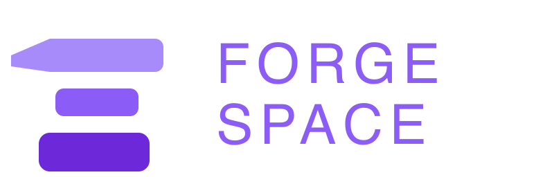
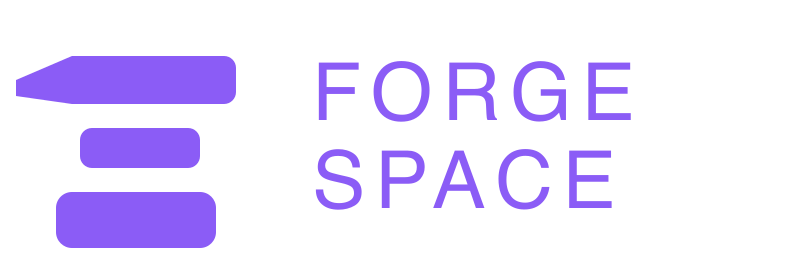
Logos


Favicons

Open Graph Images
Default and Article OG images use a 1200 × 630 canvas; Social uses 1200 × 1200. Key content (logo and text) stays comfortably inside an approximate 80px safe inset on all sides so platform crops don't clip anything important. Background treatment uses a flat `#121214` base with a subtle centered purple blur and a thin inset frame for stronger brand identity. Logo and wordmark use the main brand purple palette (not white) for clear contrast on the blur; layout is a horizontal lockup (icon left, text right). Typography: Sora for heading/wordmark and DM Sans for supporting copy.


After updating OG assets, remember to refresh caches on platforms like LinkedIn, Facebook, and Twitter/X using their preview/debug tools so new images appear in link previews.
Design Token Packages
W3C Design Tokens (JSON)
Industry-standard token format, compatible with Style Dictionary and Figma
Tailwind CSS Preset
Drop into your tailwind.config.ts as a preset
Sass Variables
Sass variable definitions for traditional CSS workflows
React Theme (TypeScript)
Typed theme object for styled-components, Emotion, or custom theming